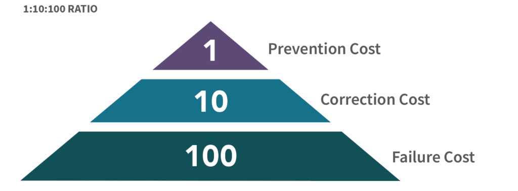
Nowhere is this more relevant than in accessibility, where an inaccessible website can lead to lost business or worse: a lawsuit. Earlier this month a legally blind woman made the news after filing 34 lawsuits against companies with inaccessible websites. It’s no secret that many of the companies now scrambling to make their websites accessible are doing so because of lawsuits like these, and the resulting settlements (1:10:100:1000?).
Attempting to bolt accessibility onto an existing website or app is difficult. Our developers and designers can absolutely do that, but I’ve seen cases where it’d make more sense to start a website from scratch than to try and resolve all the accessibility issues within the existing architecture. We offer accessibility training for content managers for the same reason: it’s easier to write the alternative text for images right the first time than to go back and fix hundreds or thousands of image assets.
If your website or app is already built, a manual review can identify the highest-priority fixes and help you focus on them first: Can I order your product? Can I contact you? There might be one or two issues that mean the difference between a site that’s unusable and one that’s merely annoying. An accessibility QA specialist can help you identify and remediate those issues, so that you have time and breathing room to roadmap out full WCAG (Web Content Accessibility Guidelines) 2.0 A/AA conformance. This is still difficult, but not as difficult as having to remediate dozens of issues because someone other than you determined that your site was inaccessible.
But let’s say we can catch accessibility issues before they become a problem. John Thompson’s post, Accessibility and Empathy: Creating the Best Digital Experience for Disabled Users, has some great tips for every step of the process that will make your product better for literally everyone, and I’d recommend that you make sure your content managers, developers and designers are familiar with the methods he described there.
If they’re not, or really even if they are, that $1-inflation-adjusted integrated testing by an accessibility specialist can go a long, long way. A site that may take hundreds of hours to build might only take an hour or two for QA to review during the design phase. Is the contrast sufficient? What are the headings here? How will this graph be presented to blind users? How will your captchas accommodate users with cognitive disabilities?
Contrast is a great example. A contrast change early in the process can be an easy conversation. A simple color change to your website or app after all the stakeholders have agreed on your branded colors can involve multiple meetings, in addition to the development and design effort involved.
Our accessibility test plan does not vary that much from project to project, because the WCAG rules for conformance don’t vary from project to project, and our testers can anticipate what they’ll be testing later as early as the first wireframed designs.
During the development phase, integrated accessibility QA can review prototypes — and test one form before you build the other 12. A few minutes of standing behind a developer as they demonstrate how something will function means less issues later, which means less time fixing issues and more time building the product.
Developers and designers who work with an integrated accessibility tester learn to anticipate the issues we’re looking for, and in later phases of the project there’s less and less to find. I’ve seen designs with absolutely no accessibility issues, from designers with no formal training in accessibility at all.
And once the product reaches QA, an accessibility tester who’s already familiar with the design and development is more efficient.


